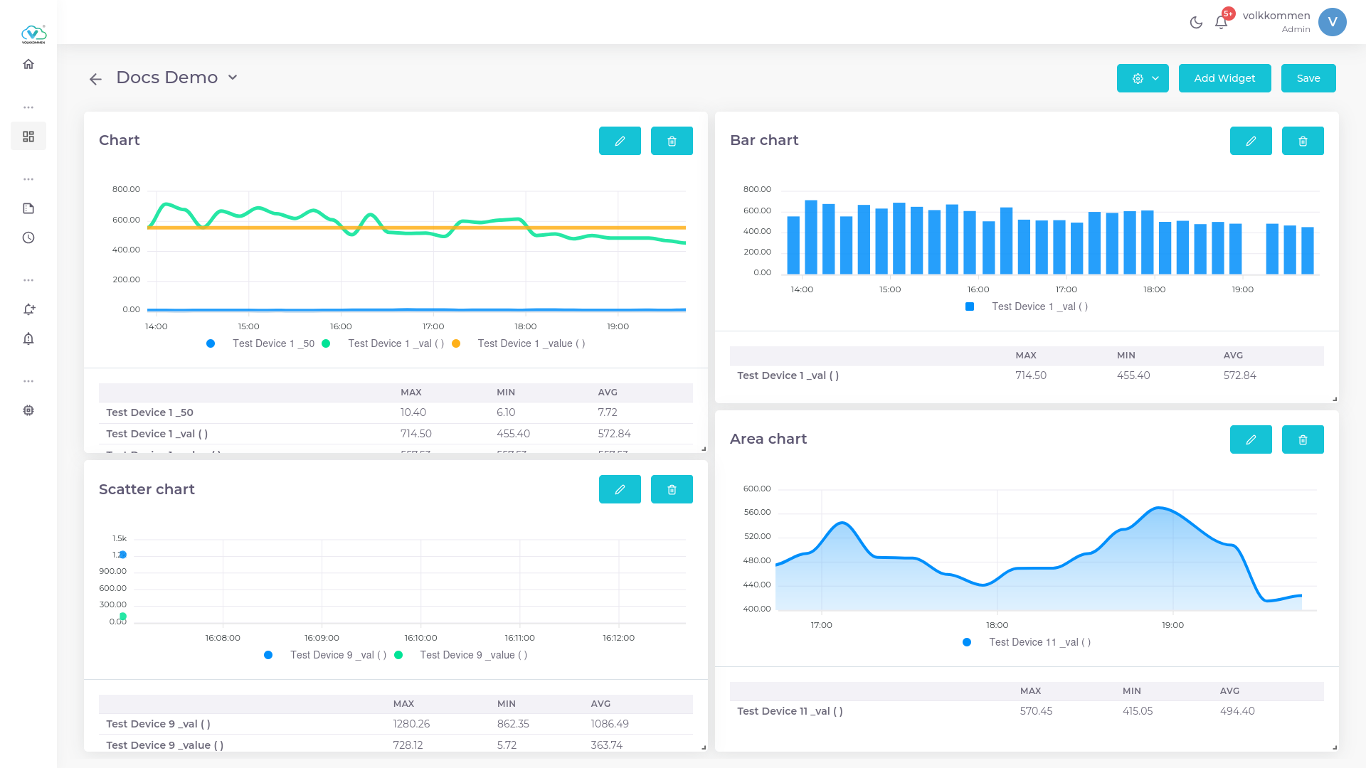
¶ Charts
Charts are the basic visualization model that is used for most of the data sets.
¶ Overview
time series Charts are widgets designed to represent data values with respect to time
 .
.
¶ Data
In the Chart Widget, you can select multiple devices and parameters as needed.
- The first dropdown at the bottom of the page is used to select devices.
- The dropdown next to it is used to select parameters.
This flexibility allows for a comprehensive comparison of data from different devices within a single chart
¶ Configuration
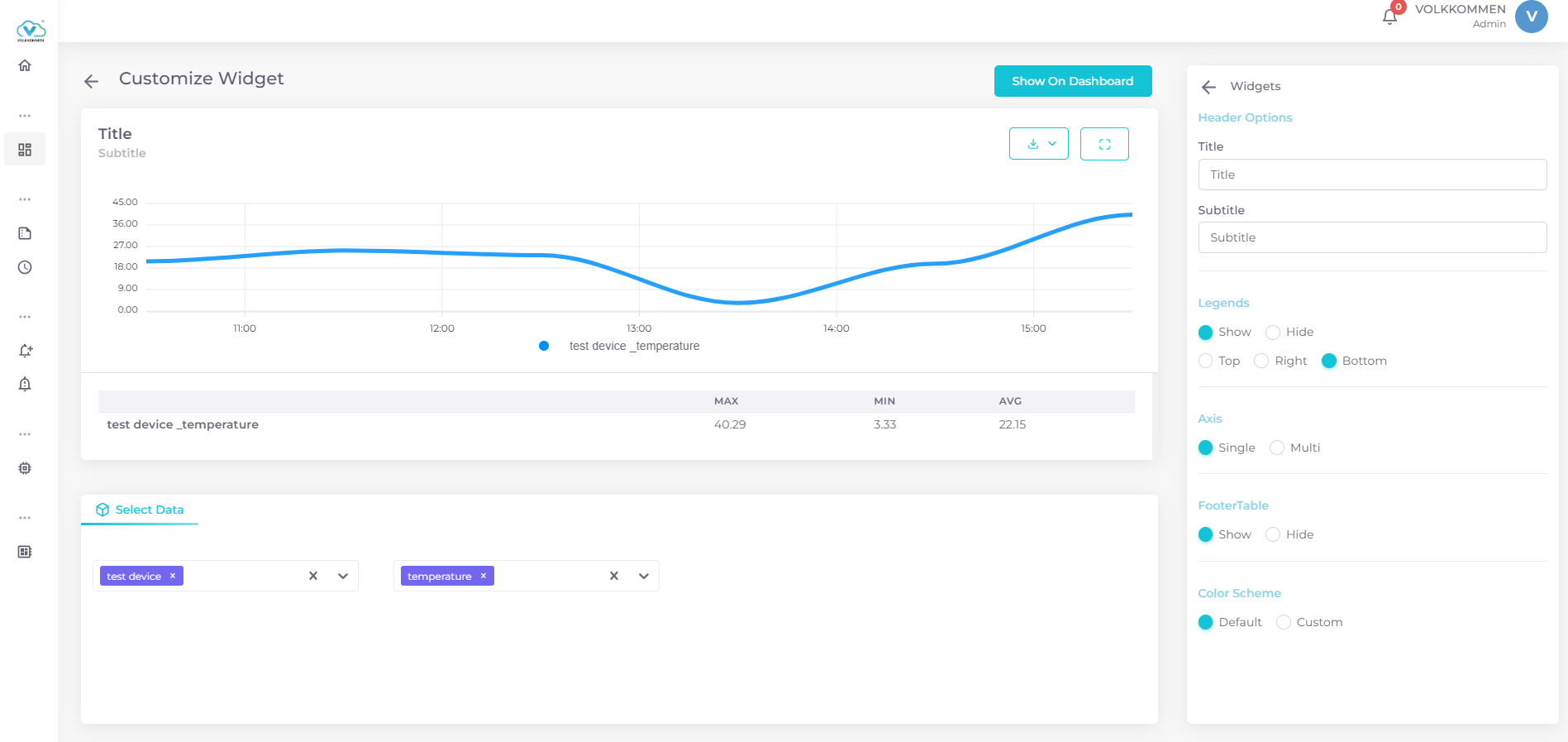
To create your Chart Widget, follow these steps:
- Select Data: Choose your data from the bottom query panel. Select your device and parameter. You can select multiple devices and parameters for comparison within a single chart.
-
Editing Chart Features: The panel on the right side is where you can configure the chart features.
- Title and Subtitle: First, input a title for your chart. If needed, you can also provide a subtitle.
- Legends: Legends define the color used for each parameter in the chart. You can position the legends at the top, right, or bottom of the chart.
- Footer Table: A very useful feature, the footer table, displays the maximum, minimum, and average values of every parameter in the chart. You can enable or disable this feature by clicking the Footer Table checkbox.
-
Multi-Y-Axis: This feature is helpful for users who need to display multiple data sets in a single widget. To use multi-y-axis:
- Ensure that you have selected multiple data sources.
- Enable the Multi-Y-Axis feature.
- A selection menu will appear, allowing you to label each Y-axis (you can also create a custom label by selecting "Create New").
- Select the desired parameter for each Y-axis.
- To add more parameters to an Y-axis, click the plus (+) button and choose the next parameter.
- Use the Add Axis button to add additional axes and assign data to each one.
-
Color Scheme: Choose a color scheme for each parameter to suit your needs, allowing for better customization and clarity in data representation.
This configuration ensures that your chart widget is both informative and visually appealing, with all the necessary features for data comparison and presentation.