¶ Table
Let's see how to create a table widget.
¶ Overview
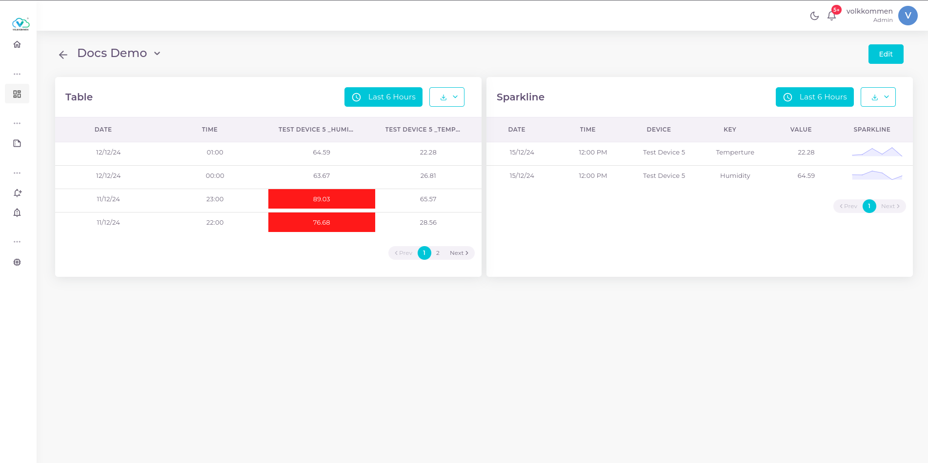
The Table Widget is designed to display data in a structured, readable format similar to a report. It allows you to represent any selected parameter in a time-series format. Unlike a standard report, the Table Widget includes additional features such as threshold-based coloring and sparklines for historical data insights.
Key Features:
-
Threshold-Based Coloring
- In the figure above, the widget named "Table" demonstrates a basic table widget with threshold-based conditions.
- The parameter "TEST DEVICE 5_HUM" has a threshold value of 70.
- Values above 70 are highlighted in red for quick identification.
-
Sparkline Feature
- The widget named "Sparkline" is an advanced Table Widget with the Sparkline option enabled.
- This table displays the latest data for selected parameters and includes a small line chart in the same row, showing the trend of the last 20 data points.
- Clicking on the sparkline allows users to view historical data for that parameter.
This widget is highly useful for monitoring real-time data and identifying trends at a glance!
¶ Data
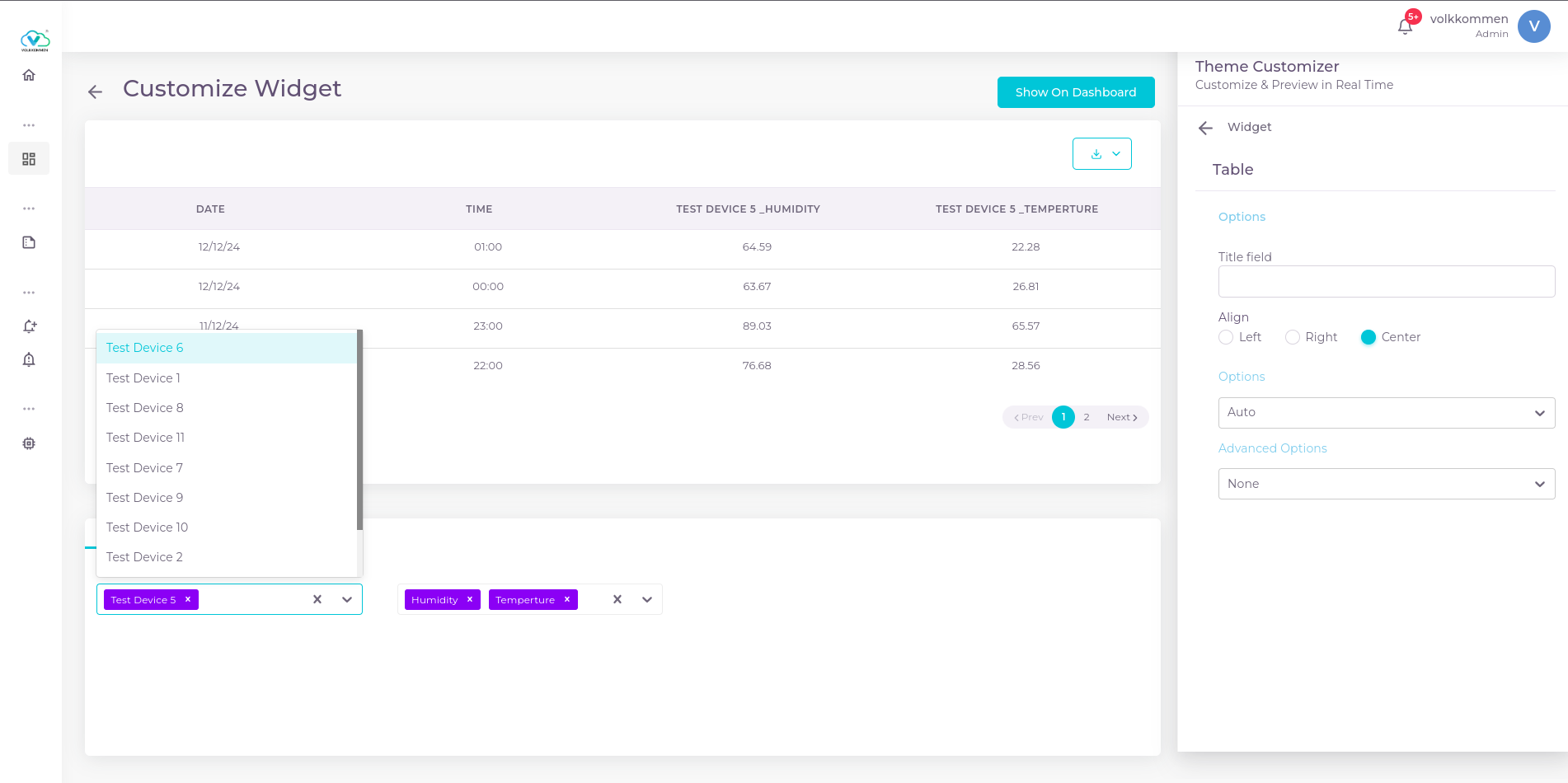
In the Table Widget, you can select multiple devices and parameters as needed.
- The first dropdown at the bottom of the page is used to select devices.
- The dropdown next to it is used to select parameters.
The data selection panel should look like this:
¶ Configuration
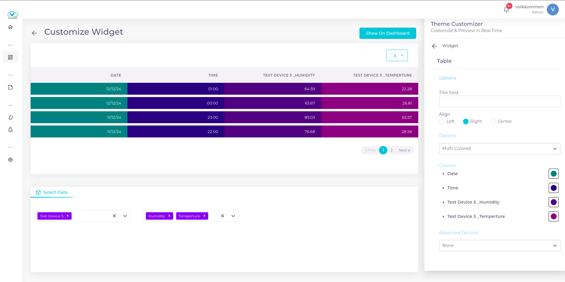
Now lets go and create a table widget. There is a input field for title which is a mandatory field in every widget. Then you can select the alignment of data to be shown, weather you need to align data inside table to right, left or center.
Now there is an options dropdown which have the coloring options of table..
- Auto
Auto mode is the normal default mode where there will be no color or thresholds. it shows just plain data. - Colored
The colored option is used to give color to the entire rows of table. By selecting that a color picker will appear and you can select any color from that which will be given to every rows of the table - Multi colored
This option gives more customization in visualization. By selecting you will listed every parameters in table and a color picker near that parameters. We can select a color for each parameters.
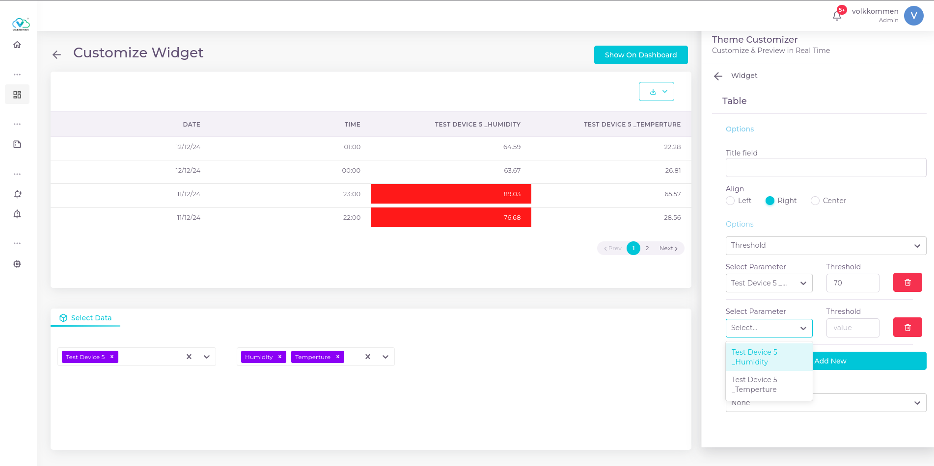
- Threshold
This option is used while visualizing critical parameters to know if some value have gone beyond threshold. When selected threshold you will see a dropdown where you can select any parameter and there is an input box where you can enter the threshold value. For adding threshold for next parameter you can click the "add new" button thus an another similar dropdown and input box appear where you can select another parameter and enter its threshold value.
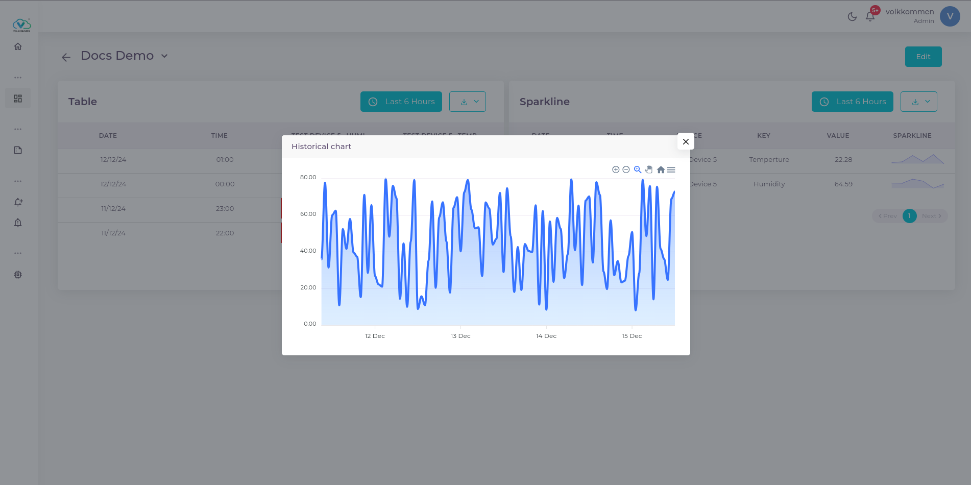
Later in the advanced options dropdown there is a sparkline option. When you select that your history data from table widget will disappear and only the latest value will remain. Along with the latest values there will be a sparkline which shows the last 20 data trend. You can also click that row to show the historical trend of data.
the historical chart look like...
after selecting all needed options you can select show on dashboard button to view it on dashboard.